Plot results#
# Matplotlib for plotting
import matplotlib.pyplot as plt
import numpy as np
plt.close('all')

# Set plot font to size 14
font = {'size'   : 14}
plt.rc('font', **font)

# Get array of default plot colors
prop_cycle = plt.rcParams['axes.prop_cycle']
colors     = prop_cycle.by_key()['color']


fig = plt.figure()
ax=fig.gca()
expData = np.genfromtxt('exp_data/wang2016_eq_stretch.csv', delimiter=',')
plt.scatter(expData[:,0] - expData[0,0] + 1.0, expData[:,1] - expData[0,1], s=25,
                     edgecolors=(0.0, 0.0, 0.0,1),
                     color=(0.0, 0.0, 0.0, 1),
                     linewidth=1.0, label=r"$\dot\lambda = 0.9 \times 10^{-4}$" + r" s$^{-1}$")
#-------------------------------------------------------------
ax.set_xlim(1,10)
ax.set_ylim(0, 400)
#plt.axis('tight')
plt.grid(linestyle="--", linewidth=0.5, color='b')
ax.set_xlabel(r'$\lambda$',size=14)
ax.set_ylabel(r'$T_{R \, 22}$, kPa ',size=14)
#ax.set_ylim([0, 60])
from matplotlib.ticker import AutoMinorLocator,FormatStrFormatter
ax.xaxis.set_minor_locator(AutoMinorLocator())
ax.yaxis.set_minor_locator(AutoMinorLocator())
# plt.show()
plt.legend()

fig = plt.gcf()
fig.set_size_inches(7,5)
plt.tight_layout()
plt.savefig("results/experiment_eq_curve.png", dpi=600)
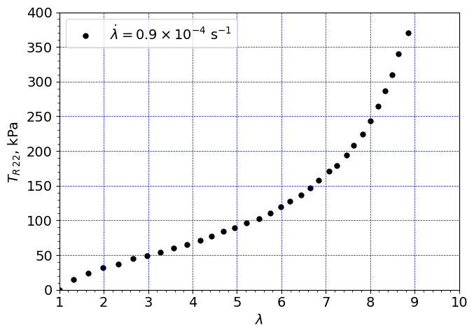
fig = plt.figure()
ax=fig.gca()
expData = np.genfromtxt('exp_data/Hossain2012_stretch2p5_rate0p01.csv', delimiter=',')
plt.scatter(expData[:,0] - expData[0,0] + 1.0, expData[:,1] - expData[0,1], s=25,
                     edgecolors=colors[0], #(0.0, 0.0, 0.0,1),
                     color=colors[0], #1, 1, 1, 1),
                     linewidth=1.0, label=r"$\dot\lambda = 0.01$" + r" s$^{-1}$")

expData = np.genfromtxt('exp_data/Hossain2012_stretch2p5_rate0p03.csv', delimiter=',')
plt.scatter(expData[:,0] - expData[0,0] + 1.0, expData[:,1] - expData[0,1], s=25,
                     edgecolors=colors[1], #(0.0, 0.0, 0.0,1),
                     color=colors[1], #(1, 1, 1, 1),
                     linewidth=1.0, label=r"$\dot\lambda = 0.03$" + r" s$^{-1}$")

expData = np.genfromtxt('exp_data/Hossain2012_stretch2p5_rate0p05.csv', delimiter=',')
plt.scatter(expData[:,0] - expData[0,0] + 1.0, expData[:,1] - expData[0,1], s=25,
                     edgecolors=colors[2], #(0.0, 0.0, 0.0,1),
                     color=colors[2], #(1, 1, 1, 1),
                     linewidth=1.0, label=r"$\dot\lambda = 0.05$" + r" s$^{-1}$")


plt.grid(linestyle="--", linewidth=0.5, color='b')
ax.set_xlabel(r'$\lambda$',size=14)
ax.set_ylabel(r'$T_{R \, 22}$, kPa ',size=14)
ax.set_ylim([0, 60])
ax.set_xlim([1, 2.6])
from matplotlib.ticker import AutoMinorLocator,FormatStrFormatter
ax.xaxis.set_minor_locator(AutoMinorLocator())
ax.yaxis.set_minor_locator(AutoMinorLocator())
# plt.show()
plt.legend()

fig = plt.gcf()
fig.set_size_inches(7,5)
plt.tight_layout()
plt.savefig("results/experiment_neq_curves_v1.png", dpi=600)
fig = plt.figure()
ax=fig.gca()
expData = np.genfromtxt('exp_data/Hossain2012_stretch2p5_rate0p01.csv', delimiter=',')
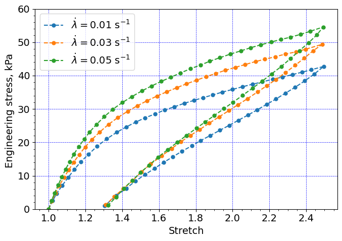
plt.plot(expData[:,0] - expData[0,0] + 1.0, expData[:,1] - expData[0,1],
color=colors[0], marker='.', linestyle='--', markersize=10,
linewidth=1.5, label=r"$\dot\lambda = 0.01$" + r" s$^{-1}$")
expData = np.genfromtxt('exp_data/Hossain2012_stretch2p5_rate0p03.csv', delimiter=',')
plt.plot(expData[:,0] - expData[0,0] + 1.0, expData[:,1] - expData[0,1],
color=colors[1], marker='.', linestyle='--', markersize=10,
linewidth=1.5, label=r"$\dot\lambda = 0.03$" + r" s$^{-1}$")
expData = np.genfromtxt('exp_data/Hossain2012_stretch2p5_rate0p05.csv', delimiter=',')
plt.plot(expData[:,0] - expData[0,0] + 1.0, expData[:,1] - expData[0,1],
color=colors[2], marker='.', linestyle='--', markersize=10,
linewidth=1.5, label=r"$\dot\lambda = 0.05$" + r" s$^{-1}$")
plt.grid(linestyle="--", linewidth=0.5, color='b')
ax.set_xlabel(r'Stretch',size=14)
ax.set_ylabel(r'Engineering stress, kPa ',size=14)
ax.set_ylim([0, 60])
from matplotlib.ticker import AutoMinorLocator,FormatStrFormatter
ax.xaxis.set_minor_locator(AutoMinorLocator())
ax.yaxis.set_minor_locator(AutoMinorLocator())
# plt.show()
plt.legend()
fig = plt.gcf()
fig.set_size_inches(7,5)
plt.tight_layout()
plt.savefig("results/experiment_neq_curves_v2.png", dpi=600)